Web Development Concepts All Web Designers Should Understand
- October 28, 2016
- Posted by: Sadman Sakib
- Category: Beginners Guide

There’s a lot to be said about the divide found between designers and developers. Granted there are many designer/developer hybrids who can understand both sides of the coin, but they’re few and far between.
Creative projects thrive on proper communication. However this can be difficult when designers and developers aren’t sure about how to talk to one-another. I don’t think designers need to know how to write proper JavaScript, nor should developers master typography selection. But there are some fundamental topics that I think go both ways.
The following topics are my own personal take on vital web development ideas that all designers should understand. As a designer/developer myself, I know how confusing it can be studying both areas. But it’s always worth the effort to learn because a clear understanding improves communication and makes a designer much more valuable to a creative team.
Frontend Code Behavior
Web designers are often thought to have frontend skills along with their design talents. This is a hotly debated topic, mostly because there’s no correct answer.
Designers should do what they are comfortable with. If that means only doing visual design work, then so be it. However a brief understanding of frontend technologies can make the same designer more intuitive when creating assets for developers.
I believe every designer should at least understand the three fundamental languages of frontend development (HTML, CSS, and JS) along with how they’re used. For example, most dropdown menus rely on JavaScript but there are CSS-only alternatives as well.
When a designer is crafting a dropdown menu, they can think about the complexity of implementing it via code. A designer who understands which elements require JavaScript can be better prepared to understand what they’re asking developers to build.
This is possible without learning to write a single line of code.
CSS is made to style the website. It’s mostly static aside from CSS animation, and CSS creates the majority of visuals on a page. Most dynamic features are created with JavaScript.
If you can understand this divide it will breathe a conscious effort into the design work. It will also force UX motion designers to consider how much work goes into animating an interface.
Responsive Techniques
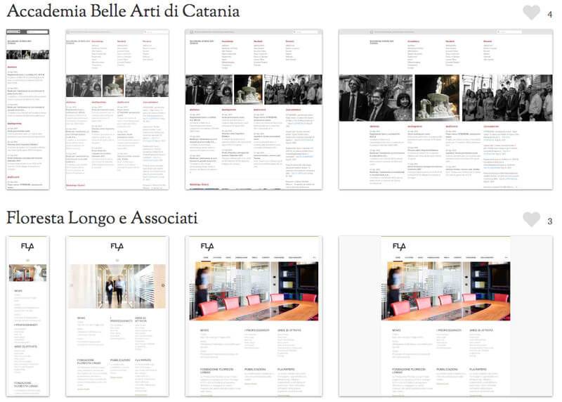
Every web designer should at least know the term responsive design. This allows websites to adapt to different screen sizes, to each of which a different layout belongs. Device dimensions when a new layout is applied are defined by breakpoints, added in (one of) the CSS file(s).
Breakpoints are specified by a certain pixel width (and/or sometimes height), either minimum or maximum, at which the layout adapts to fit that screen size. So a responsive layout will look different on a 1080px monitor than on a 320px smartphone.
To see how breakpoints work on real sites check out the Media Queries website.

Your job as the designer is to consider how each breakpoint might influence the mockup. You may be tasked with designing several comps, each fitting into different screen dimensions.
Once you have understood that a CSS breakpoint defines the conditions when the layout changes, you’ll have a much easier time delivering these assets to the dev team.
Think Modular With Designs
Developers always want to reuse code as much as possible, as this approach makes development less verbose and cuts down file sizes — in fact it’s an important code optimization technique.
Modular design describes a method of creating websites out of “modules” that can be reused over time. Think buttons, form inputs, heading styles, or blockquotes with fancy stylings.
If you design elements modularly, it becomes easier for developers to code the layout with reusable CSS classes. It’s always a good idea to think about where you can reasonably reuse the same colors, textures, and page elements, however you need to be smart about it not to harm overall aesthetics.
It’s even better if you annotate which elements you have copied across different mockups, so that developers can mark up these parts of the site with repeat code — making development quicker and simpler.
Modular design relates to atomic design, both approaches are rather geared towards developers. However visualization can help you understand how the code works, so if you’re struggling to visualize modular design check out this post to see a few examples.
Understand Retina Images & SVG
Usually it’s the designer’s job to prepare images, capture any necessary photos, and design icons from scratch. This means designers are solely responsible for delivering the visual assets that developers eventually code into the layout. This is why it’s important to understand retina sizes and to pass retina-supported assets to the developers along with the final mockup(s).
I would highly recommend this Smashing Magazine post if you want to learn more about retina design workflows. Retinize It is a free collection of Photoshop actions which can automatically create retina versions of your assets.

Most designers already know to support @2x images, but the newer iPhone 6+ devices have @3x resolutions. However some projects don’t bother with @3x image sizes, so talk with your project leader before finalizing any assets.
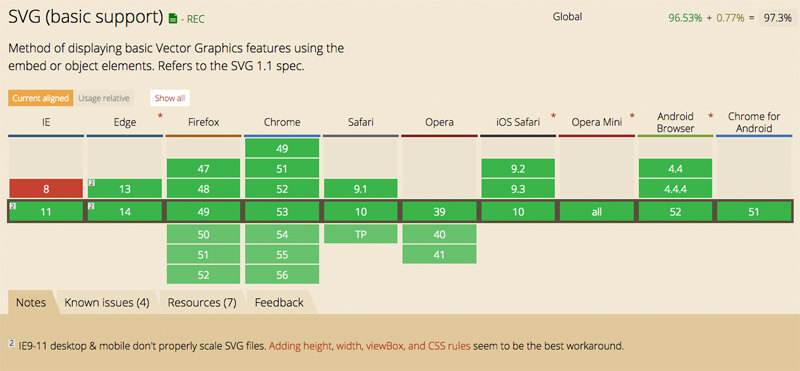
One last thing to consider is the advancement of SVG on the web. All modern browsers support SVG which is a vector-based image format. This means SVG icons will automatically scale without any quality loss, so you don’t need retina assets for SVG graphics.

Not all creative teams are willing to go with SVGs for web design though. They’re supported by browsers for sure, but in some cases they can also be tricky to implement. This is why communication is vital for a successful designer/developer relationship.
Discuss the pros & cons of using vector graphics and decide whatever works best for each project. By just having an understanding of these features you’ll be able to communicate with developers clearly, and even help them code the layout for retina support.
Understand Accessibility
Progressive enhancement and graceful degradation are two different ways of handling the same problem: accessibility. Not all users will be on devices or run browsers that support 100% of a website’s dynamic features.
These users should still get an experience that works, and this needs to be handled with proper coding. Some screen readers might ignore all JavaScript and CSS code, but the website still needs to function.
I recently did a post covering progressive enhancement in detail, as it’s my preferred method of development. Progressive enhancement starts with very basic features, then works up to more “advanced” features.
Graceful degradation is the opposite approach where all main features are designed first, then the developer decides how to handle these features if the user doesn’t support JavaScript or CSS.
It’s unlikely that a designer would be asked to do mockups for any of these situations. But it’s important that designers understand these terms and what they mean, because they do affect the development process. This is especially true for projects where accessibility is a big concern.
In Closing
There are some topics I skipped because I consider them optional. Version control, error handling, and JavaScript animations are a few more complex topics that designers may want to delve into.
But truthfully, the points addressed in this post will more than help designers understand the requirements of a development team. By just skimming the surface of web development you’ll gain insight that’ll help you communicate ideas and sympathize with problems that occur during production.
